How to Mix Patterns Without Overwhelming a Space
In the world of interior design, mixing patterns can feel like walking a fine line. Done right, it adds energy, identity, and sophistication. Done wrong, it can feel chaotic or distract from productivity. The key lies in balancing texture, color, and scale—creating harmony while still expressing personality.
Test Your Patterns Digitally First
Digital Mood Boards and 3D Renders are the first step of Interior Designing. 3D Renders helps to choose right composition.
Bhoomi Interiors Pvt. Ltd. is the top interior designing company to choose right composition and Pattern as per your Space.
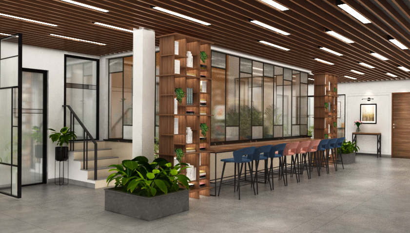
Start with a Neutral Foundation
In corporate interiors, the backdrop matters. Begin with neutral tones—soft greys, whites, beiges, or natural wood finishes. A calming base provides the visual “white space” needed to layer in bolder patterns without visual clutter.
But in large open-plan offices, a neutral base keeps the space feeling open and professional, even when adding statement patterns to breakout areas or meeting rooms.
Stick to a Cohesive Colour Palette
When working with multiple patterns, the secret is shared color. Choose a cohesive palette—three to five core colours—and make sure each pattern incorporates at least one of them. This visual link creates a sense of unity across different design zones.
For Example:
In a corporate interior design project, you might use navy, sage green, and soft taupe:
- Geometric navy carpet tiles
- Sage-striped upholstery in lounge chairs
- Taupe and white abstract art on the walls
They’re different patterns, but the colors tie them together.
Use Patterns to Define Zones
In open corporate environments, patterns can help define purpose without physical barriers. Use them to visually segment:
- Collaboration areas
- Focus zones
- Informal lounge spaces
A bold geometric floor pattern in a collaboration hub contrasts with subtle pinstripes in quiet areas—designating function and flow through pattern alone.
Incorporate Texture as a "Quiet Pattern"
Textures like woven fabrics, ribbed glass, or wood grain introduce subtle pattern without adding visual noise. In corporate design, these elements are ideal for wall panels, partitions, or acoustic features.
Textural contrast enhances tactile interest while keeping a clean, cohesive aesthetic.
Balance Bold with Calm
When using bold or busy patterns, offset them with areas of visual rest. This might mean:
- Solid-colored walls beside a patterned sofa
- Minimalist desks paired with graphic floor tiles
- Monochromatic artwork in a highly patterned lounge
This rhythm of “active” and “calm” zones helps maintain a professional tone in your corporate interior design project.
Final Thoughts
Mixing patterns is an art, but it's one that can elevate any corporate interior design project from generic to engaging. By balancing scale, color, and texture, you can create dynamic, functional spaces that support your client's brand and company culture—without sacrificing sophistication or focus.